Brand Overview

This Brand Kit is a practical guide to the visual identity of AI in Design. It brings together the core elements of the system, including typography, color, imagery, graphics, and applications, while providing guidance on how they work together. Designed to support consistency across every touchpoint, it helps teams and collaborators understand, apply, and evolve the brand with clarity and confidence.

Index

Logo
Primary logo Reductions Motion Clearspace Partnerships Incorrect usage
Color
Palette Supporting Colors Accessibility Incorrect Usage
Typography
Principal Typography Secondary Typography Everyday usage Typesetting Incorrect usage Backup Font
Brand Elements
Layouts Photography Visual Expressions Tool Graphs
Brand in use
Living System Billboards & Large Formats Web Social Media

About

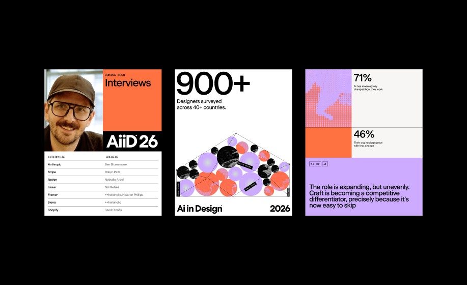
The AI in Design report, created by Foundation Capital and Designer Fund, draws on a global designer survey and conversations with leaders at Stripe, Notion, Anthropic, and more. It explores the real impact of AI on design today, in 2026.

About — AI in Design 2026

User Guide

The AI in Design Manual serves as the central reference point for the entire brand system. It brings together the visual identity, communication principles, and application guidelines into one cohesive framework, ensuring consistency across every touchpoint and format.

Built to support both internal teams and external collaborators, this manual provides the tools needed to maintain clarity, structure, and flexibility as the brand evolves. More than documentation, it is a living system designed to guide how AI in design is expressed, experienced, and understood.
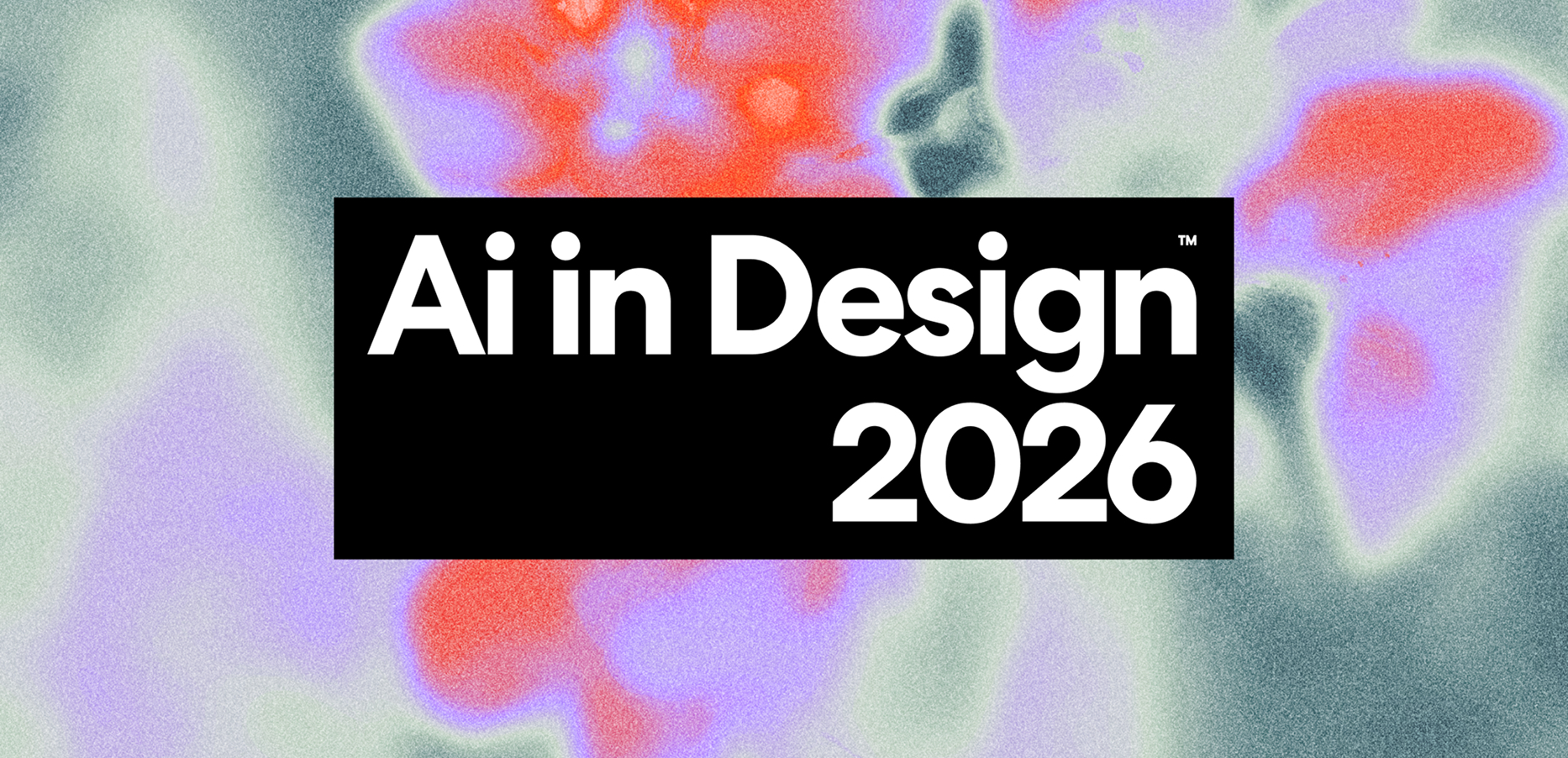
Palette

This palette exists in the space between intention and emergence. Rather than feeling fixed or overly controlled, it embraces tension, softness, and subtle contrast. It creates a sense of movement beneath the surface, allowing colors to feel layered, responsive, and slightly unresolved. More than a static selection, the palette acts as a living system that suggests constant evolution and interaction.
Color palette

Supporting colors

Supporting colors bring balance and flexibility to the system while preserving the overall visual rhythm. Core Black and Fog Green provide structure and calm, while Muted Teal and Active Blue introduce moments of contrast and energy. Digital Lilac and Signal Orange can be used strategically to create emphasis and depth without competing with the primary visual language.

Signal Orange #FE7141
Digital Lilac #CDABFE
Core Black #000000
Full White #FFFFFF
Muted Teal #7BA2AD
Fog Green #D1DDD3
Light Blue #F5F9FC
Active Blue #1787FE

Accessibility

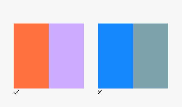
Accessibility begins with clarity and legibility. Color combinations should maintain strong contrast across interfaces and communication materials to support readability and inclusive experiences. Use high-contrast pairings between text and background elements and avoid combinations that reduce visibility or visual hierarchy.

Text Pass, AAA (7:1+)
Text Fail

Incorrect usage

Our color system is designed to create balance, movement, and intentional contrast. To preserve consistency and maintain the visual language, avoid the following:

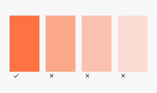
Don't overuse accent colors

Accent colors should create moments of emphasis. Excessive use reduces hierarchy and weakens their impact within the system.

Don't alter the palette values

Use the exact color values provided within the system. Small shifts in hue, saturation, or brightness can create inconsistencies across touchpoints.

Don't use colors without purpose

Color should reinforce hierarchy, meaning, or interaction. Avoid using colors decoratively without a clear function.

Don't create muddy or low-contrast combos

Gradients should preserve clarity and movement. Avoid combinations that feel desaturated, overly blended, or visually heavy.

Don't rely on one color only

The system works through balance and relationships between colors. Avoid building compositions that depend entirely on a single color.

Don't use the wrong color mode

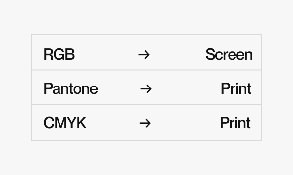
Use RGB for digital environments. CMYK or Pantone should be used for print applications. Incorrect color modes can create inconsistencies across outputs.

Typography System

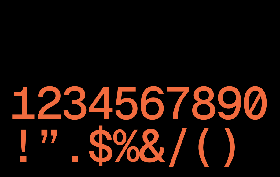
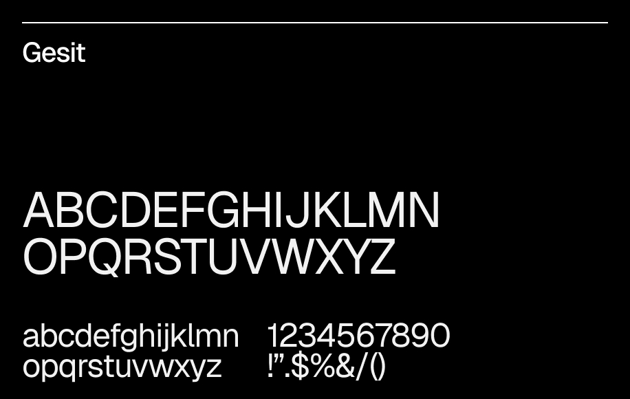
Our typographic system establishes a flexible hierarchy through two complementary typefaces. Beausite Classic brings a clean geometric structure that enhances readability and creates a clear visual rhythm across the system. Geist Mono introduces precision and functionality while adding contrast and moments of expression. Together they create a balanced system that feels structured, approachable, and purposeful.

Typography system

Principal Typography

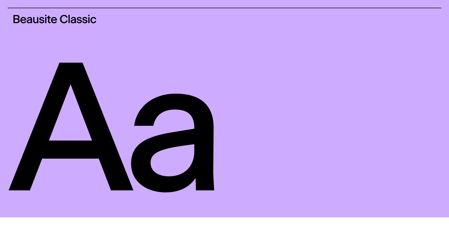
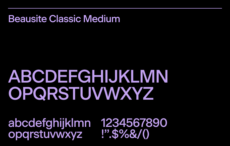
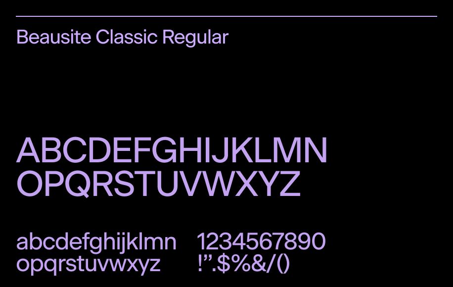
Beausite Classic is the primary typeface used across the visual system. Its geometric structure and contemporary forms create a clear hierarchy while supporting readability at different scales. Medium is used for titles and key moments, while Regular is used for body copy and longer reading experiences. Together they provide consistency, clarity, and a balanced visual rhythm.

Use for Headlines, section titles, key messaging, interface content, and body text. Medium adds hierarchy and emphasis, while Regular maintains clarity and readability.
Personality Geometric. Clear. Functional. Contemporary forms with a structured feel that balances precision and readability.
See in Drive
Principal Typography

Secondary Typography

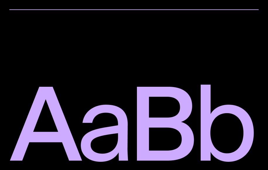
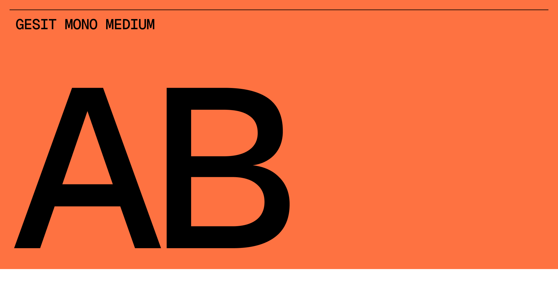
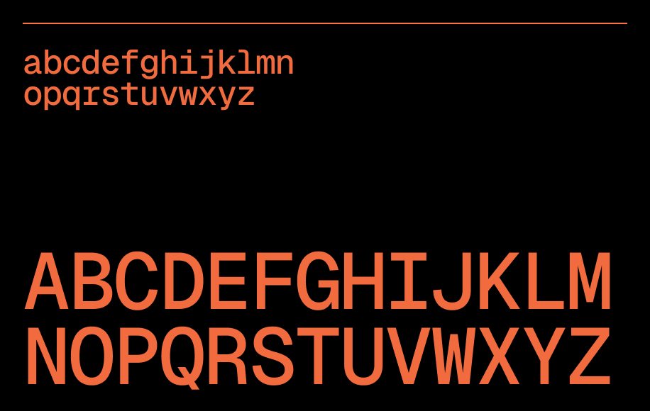
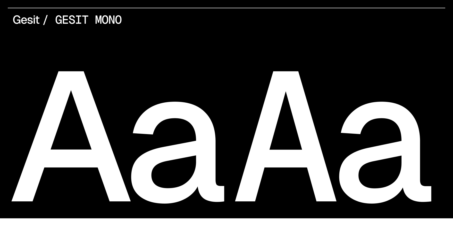
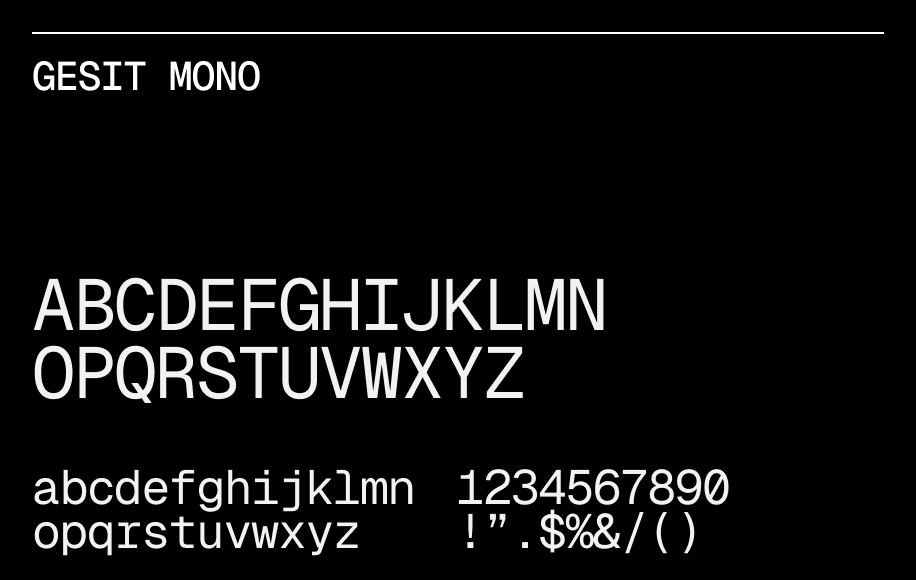
Geist Mono supports the typographic system by introducing structure, precision, and functional clarity. Used as a complementary typeface, it creates contrast within the system while reinforcing a more technical and organized feel. Its monospaced nature brings rhythm and distinctive moments across the visual language.

Use for Highlighted text, labels, section indicators, captions, and supporting information. Used for emphasis, contrast, and visual hierarchy across the system.
Personality Geometric. Clear. Functional. Contemporary forms with a structured feel that balances precision and readability.
See in Drive
Secondary Typography

Everyday usage

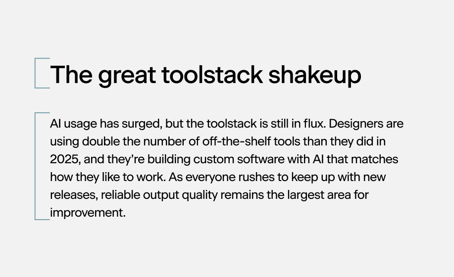
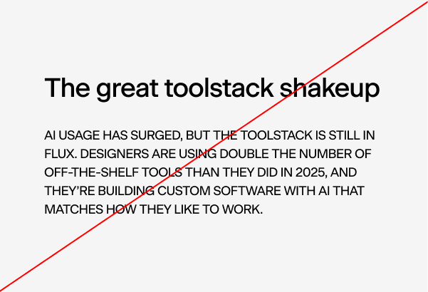
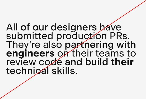
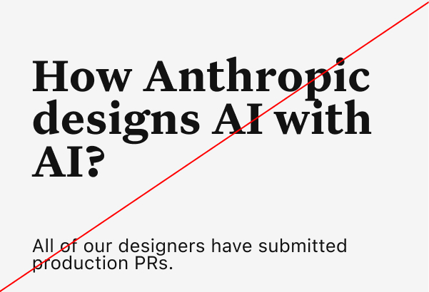
Typography in use across brand touchpoints follows a clear logic — Geist Mono anchors brand expression and identity moments, while Beausite Classic provides readable, human-centered prose in all editorial and interface contexts.

Typesetting

Precision in typesetting reinforces the system's character. Leading, tracking, kerning, and typographic hierarchy each contribute to a rhythm that feels both intentional and alive.

Headline Beausite Classic Medium
Leading: Tracking:
100% (-4%)
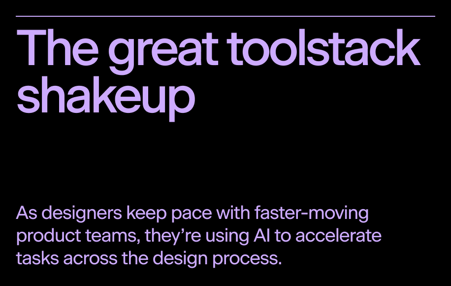
Headline typesetting — Beausite Classic Medium, Leading 100%, Tracking -4%
Text Beausite Classic Regular
Leading: Tracking:
140% (-3%)
Text typesetting — Beausite Classic Regular, Leading 140%, Tracking -3%
Subtitles / Highlighted text Geist Mono
Leading: Tracking:
100% (0%)
Subtitles typesetting — Geist Mono, Leading 100%, Tracking 0%
Headline Beausite Classic Medium
Leading: 100% Tracking: (-4%)
Headline typesetting example
Text Beausite Classic Regular
Leading: 140% Tracking: (-3%)
Text typesetting example
Subtitles / Highlighted text Geist Mono
Leading: 100% Tracking: (0%)
Subtitles typesetting example
Leading typesetting example
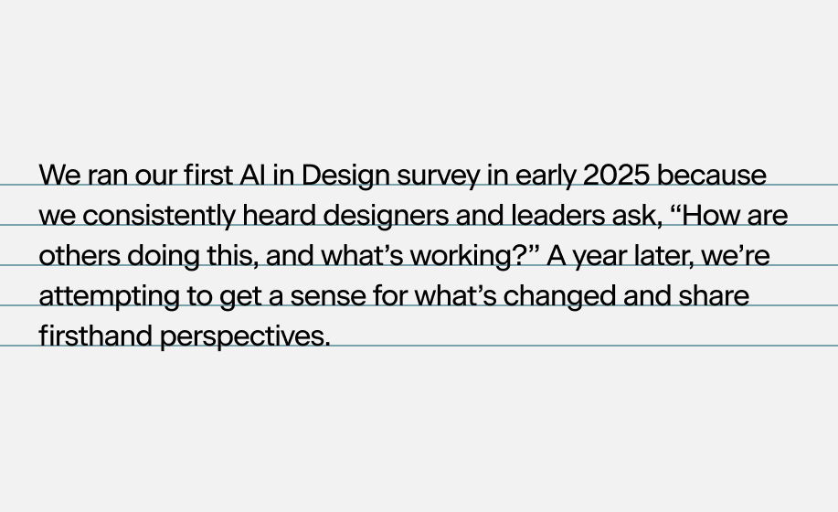
Leading Line spacing is set generously to give text room to breathe. Headlines use tighter leading to preserve visual cohesion; body text is set at 1.5× to aid sustained reading.
Tracking typesetting example
Tracking Letter-spacing is used deliberately — wider tracking in labels and caps creates clarity and hierarchy; tighter tracking in display sizes maintains tension and energy.
Kerning typesetting example
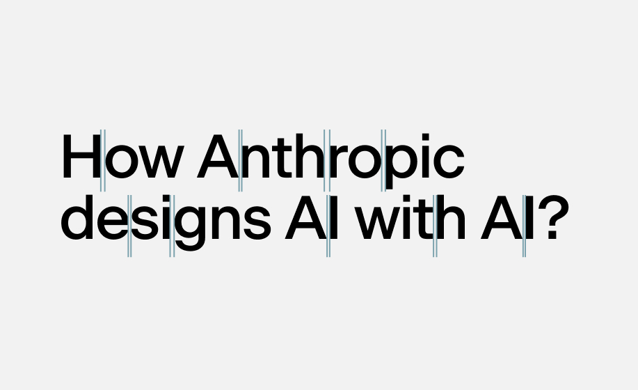
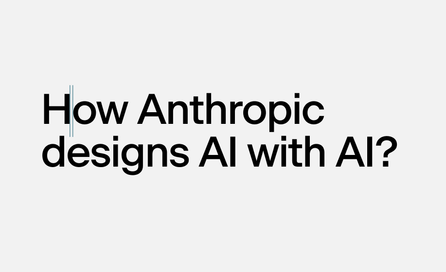
Kerning Optical kerning is applied throughout to ensure character pairs feel balanced. Avoid manual kern overrides outside of approved display settings.
Hierarchy typesetting example
Hierarchy Clear typographic hierarchy guides the reader through content. Size, weight, and spacing work together — never rely on color or decoration alone to establish order.

Incorrect usage

These are common typographic mistakes that undermine the system's integrity. Avoid all of the following treatments in brand communications.

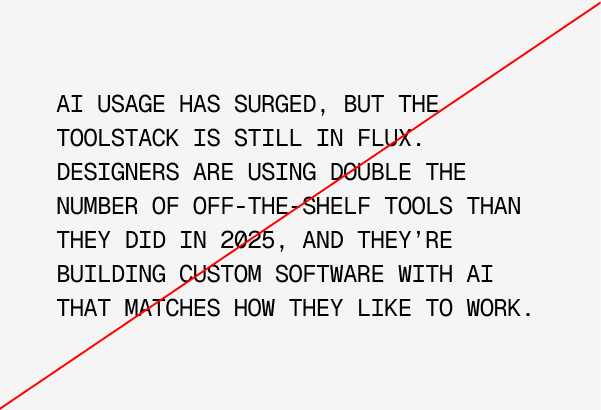
Don't: Geist Mono at large scale for body copy
Don't use Geist Mono for body copy Geist Mono is reserved for display, headlines, and brand moments. Using it for extended reading degrades legibility.
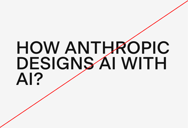
Don't: all-caps titles in body weight
Don't use all-caps for titles All-caps undermines the warmth and readability of the typographic system. Sentence case is the default for all headings.
Don't: stretch or distort type
Don't stretch or distort type Never scale type non-proportionally. Horizontal or vertical stretching destroys the intended letterform proportions.
Don't: all-caps for long-form content
Don't use all-caps for long content Capitalizing full paragraphs or extended copy removes readability and creates visual noise without meaningful emphasis.
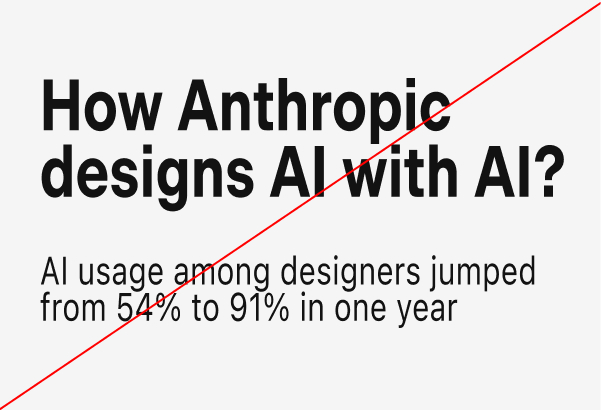
Don't: mix incompatible type weights
Don't mix incompatible weights Only approved weight pairings within the typographic system should be used. Combining unrelated weights creates visual inconsistency.
Don't: use non-brand typefaces
Don't use non-brand typefaces No typefaces outside of Geist Mono, Beausite Classic, and the approved backup font should appear in brand communications.

Backup Font

When brand fonts are unavailable — in environments that do not support custom typefaces, such as email clients, office software, or third-party platforms — the approved backup font system maintains typographic coherence. Geist and Geist Mono (free, Google Fonts) serve as system-level replacements that preserve the visual language without compromising accessibility.

See in Drive
Backup Font

Layout

The layout system is built around a language of frames, containers, and modular structures. Information is organized within clearly defined spaces that create hierarchy, rhythm, and consistency across every application.

These boxed compositions are more than a functional device. They reflect the interconnected nature of AI in Design, where ideas, people, and technologies exist within larger systems and relationships. The result is a flexible framework that supports both structure and exploration while remaining distinctly recognizable.

Photography

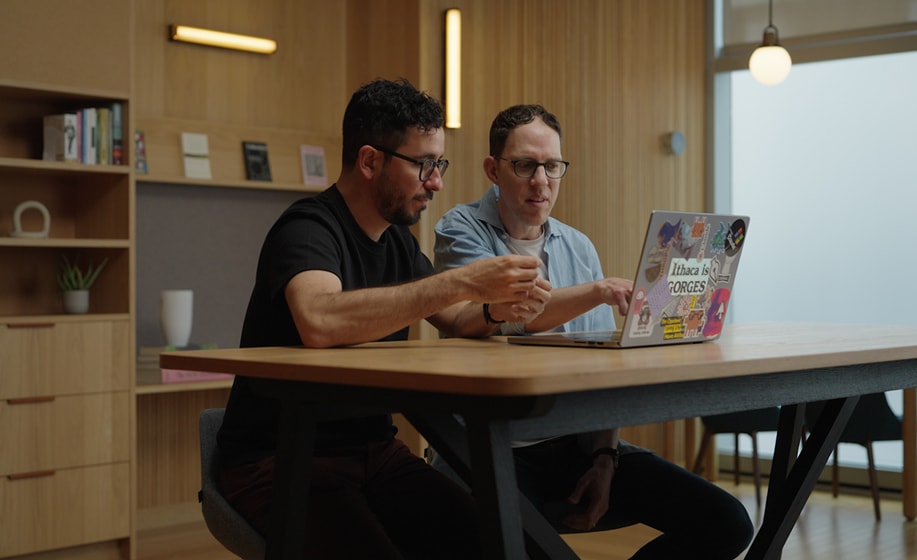
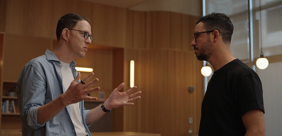
Our photography makes the AI in Design Report tangible and grounded, balancing system clarity with human context to create a visual language that feels insightful, present, and real.

Photography example — full width

Organic

Lifestyle photography captures the energy and spontaneity of life. It avoids perfection and staged setups, focusing instead on natural expressions, candid moments, and real connections. Warm color, bluish shadows for contrast and people on their medium, helping us tell stories that feel human and immediate.

Organic photography 1
Organic photography 2
Organic photography 3
Organic photography 4

Natural Light

Natural light photography embraces authenticity over control. It avoids studio setups and flash, relying instead on ambient light, soft shadows, and real environments to capture moments as they unfold, with a tone that feels honest and lived-in.

Natural light photography — full width
Natural light photography 1
Natural light photography 2

Visual Expressions

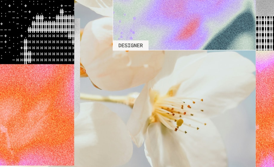
The graphic language visualizes the relationships, signals, and exchanges that shape AI in Design. Rather than relying on literal illustration, the system is built from abstract forms, textures, and interconnected structures that reflect the way ideas, people, and technologies influence one another.

Organic gradients, halftone textures, network diagrams, and modular compositions create a visual system that feels analytical yet human. Together, these elements transform complex concepts into a flexible graphic language that can scale across editorial layouts, campaigns, presentations, and digital experiences while remaining distinctly AI in Design.

Visual Expressions 01
Visual Expressions 02
Visual Expressions 03
Visual Expressions 04
Visual Expressions 05
Visual Expressions 06
Visual Expressions 07
Visual Expressions 08

Visual Tool

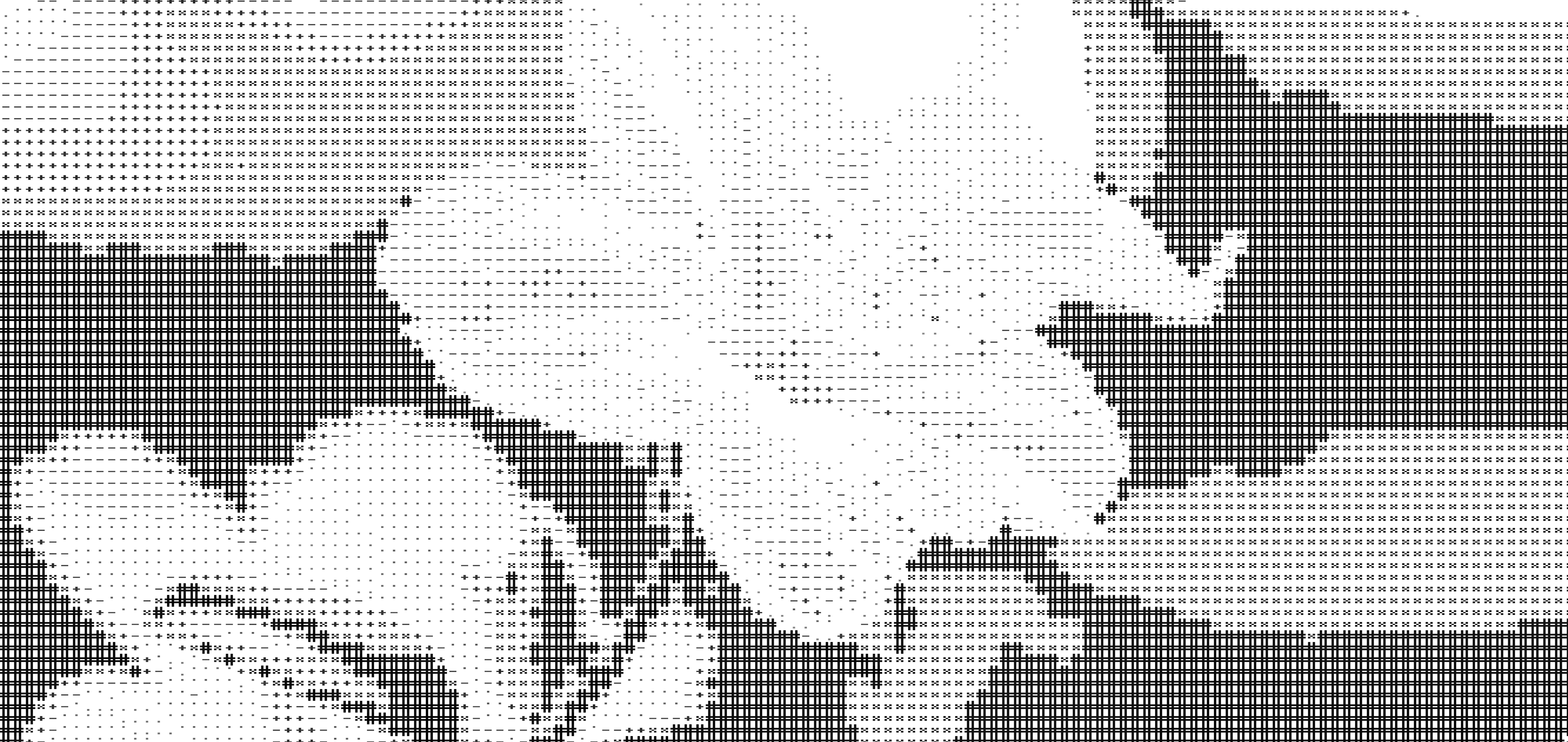
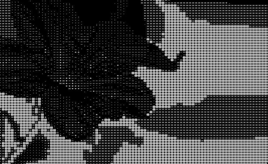
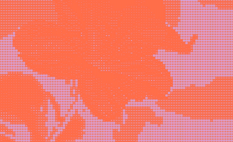
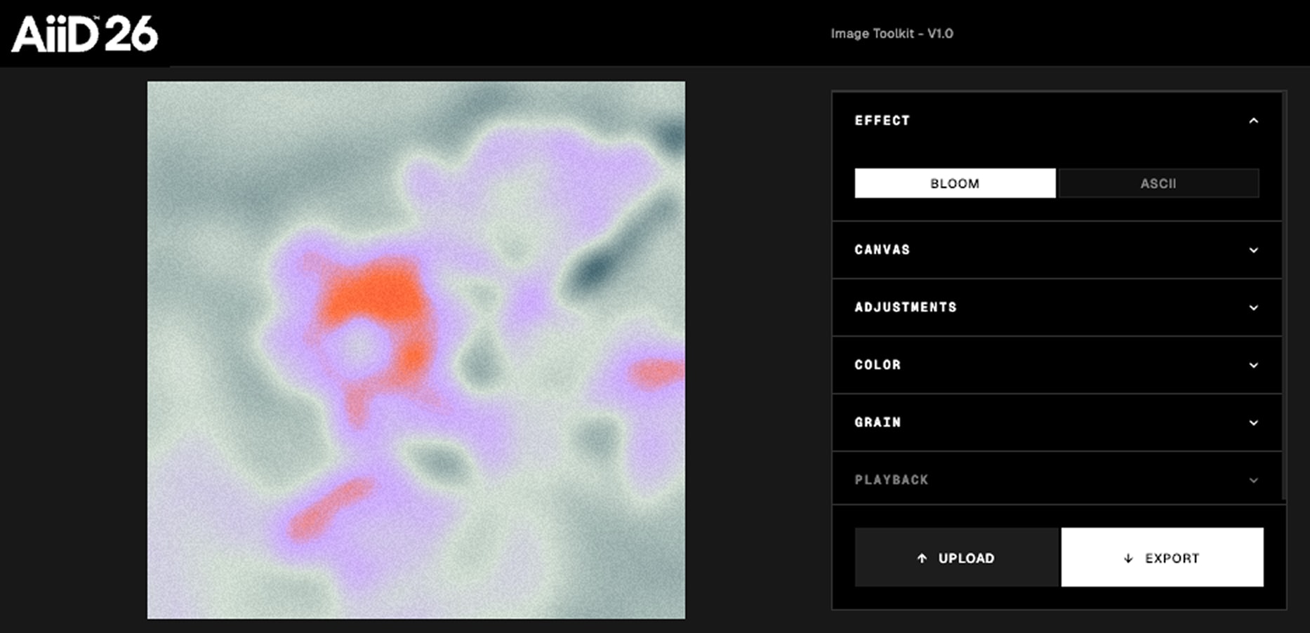
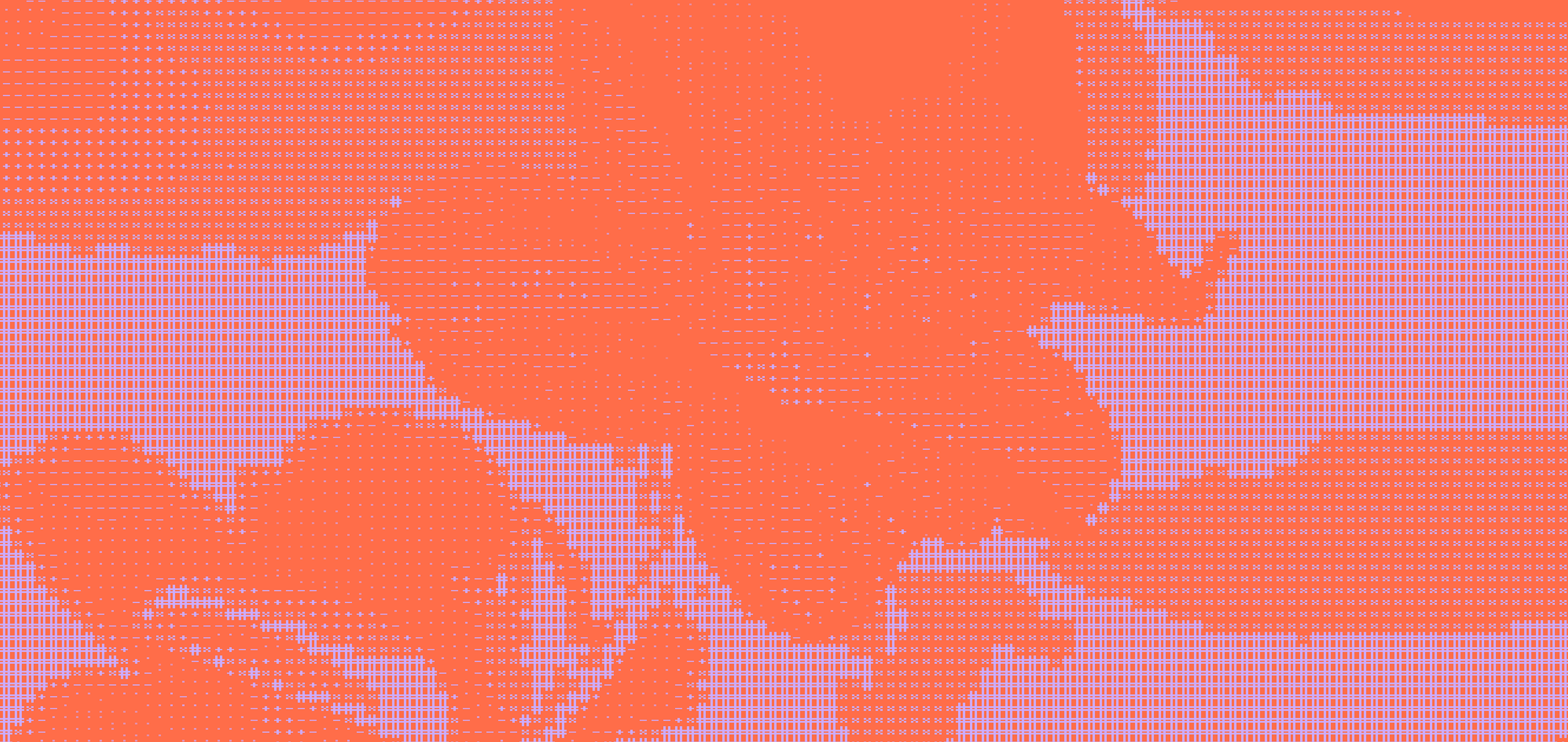
To support the creation of brand assets, AI in Design includes a custom visual tool built around two core graphic systems: Bloom and ASCII.

The tool transforms external imagery into recognizable brand expressions, either through Bloom's atmospheric color treatment or through the structured texture and pattern language of the ASCII system. Each output is generated using predefined visual rules, ensuring consistency across campaigns, editorial content, presentations, and digital experiences.

The result is a flexible production tool that helps expand the visual language while maintaining a cohesive and recognizable identity.

See Tool
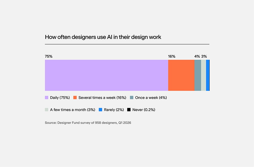
Visual tool Bloom and ASCII examples

Graphs

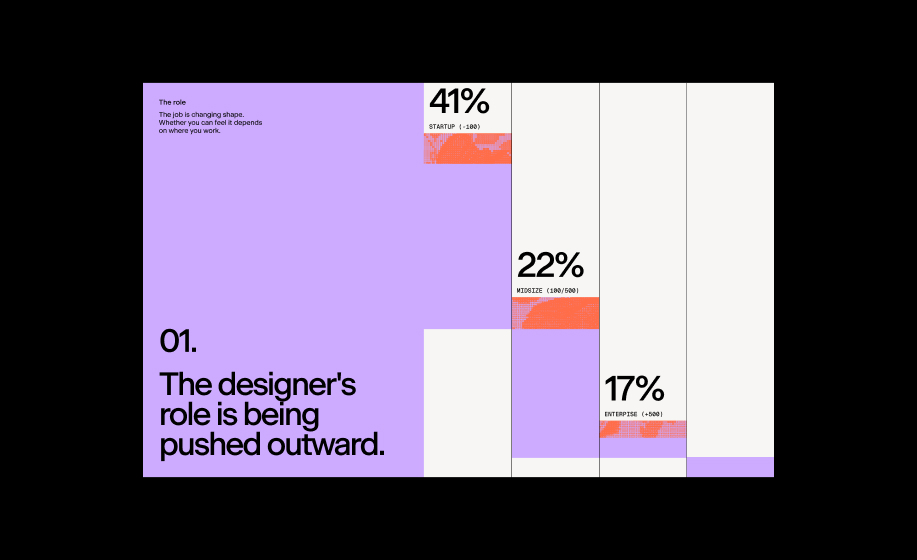
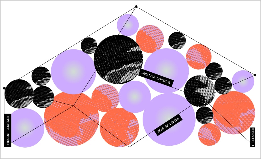
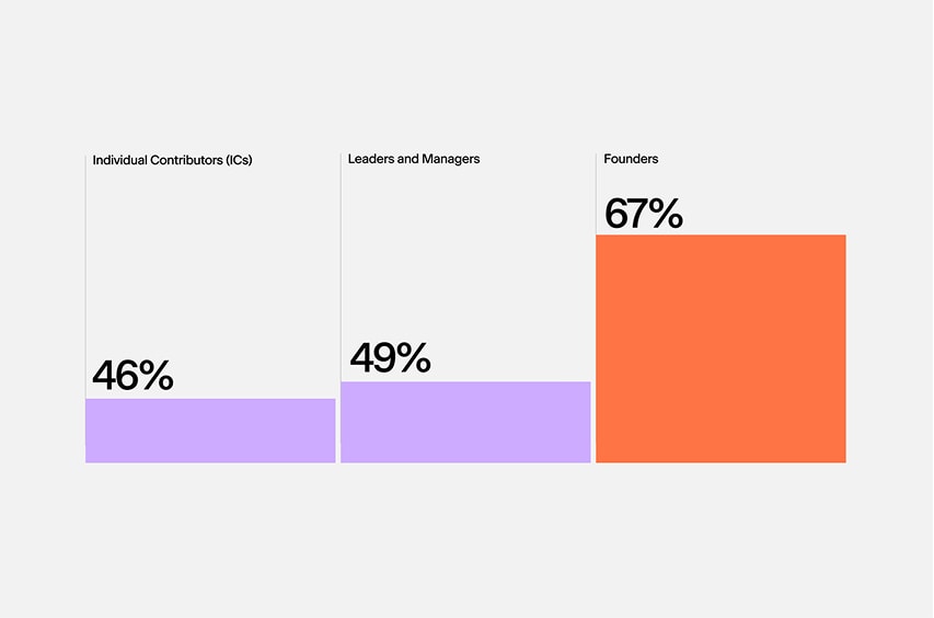
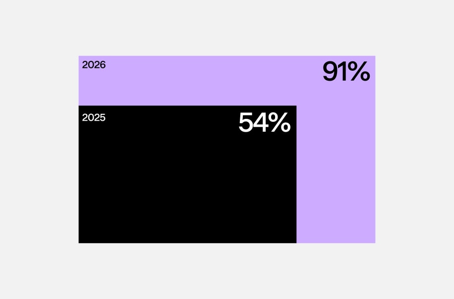
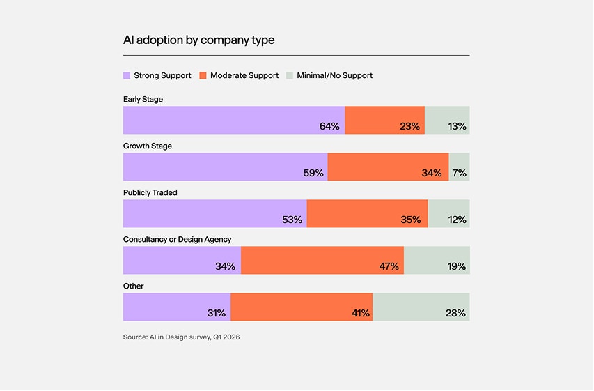
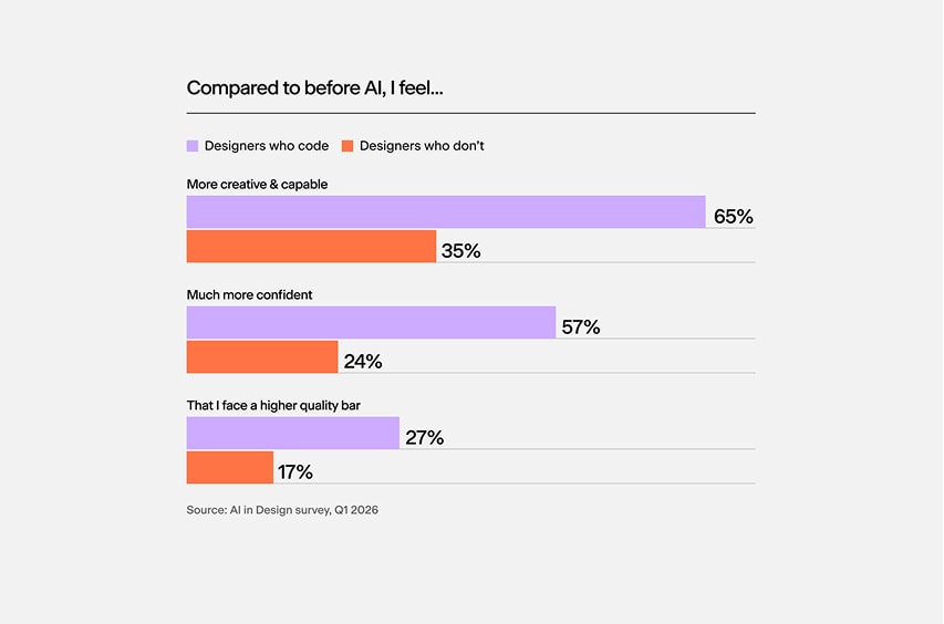
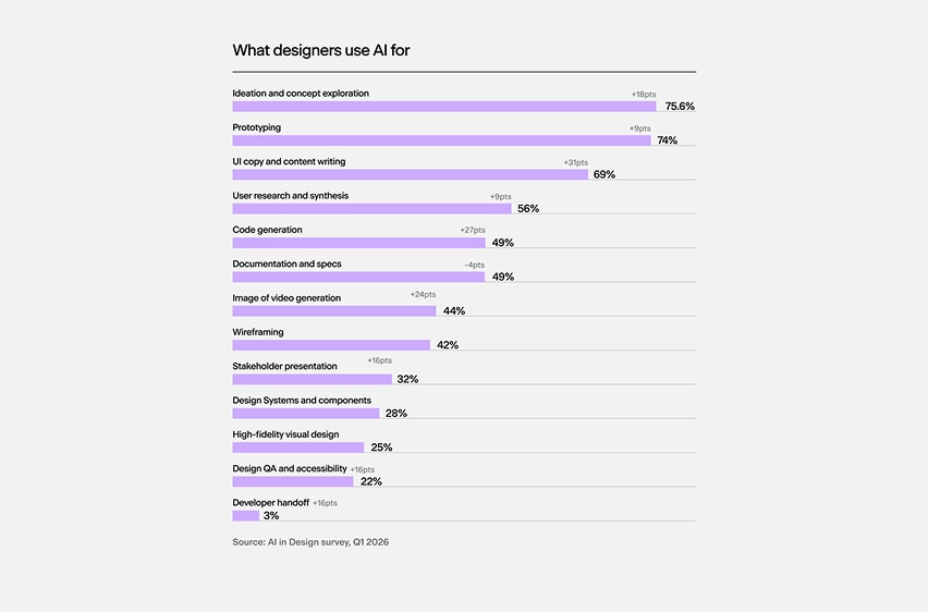
Graphics play a central role within the brand system, acting as one of its primary visual languages. Some graphics are more functional, helping communicate structure, information, and hierarchy with clarity, while others are more expressive and atmospheric. Together they create a balance between simplicity, functionality, and character, reinforcing the identity across different touchpoints.

Graph example 1
Graph example 2
Graph example 3
Graph example 4
Graph example 5
Graph example 6

Living System

This section explores how the AI in Design brand extends across different formats, contexts, and moments of communication. From editorial layouts and digital reports to motion, interfaces, and campaign assets, each application adapts to its environment while maintaining the same visual logic and narrative consistency.

Seeing the system in use reveals how the different elements interact: typography, structure, graphics, and rhythm working together to communicate clarity, analysis, and experimentation. The result is a visual language that feels informed, human, and distinctly contemporary across every touchpoint.

Billboards & Large Formats

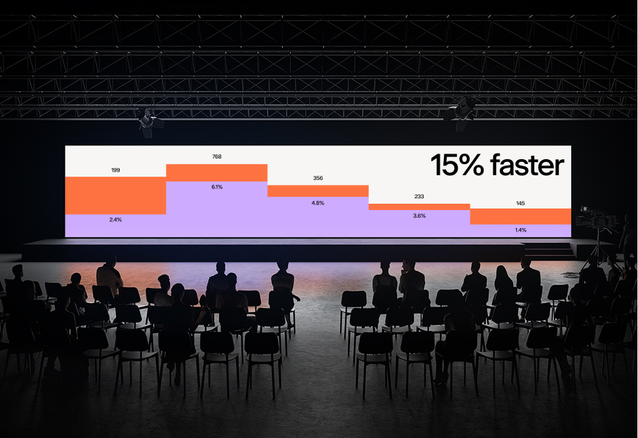
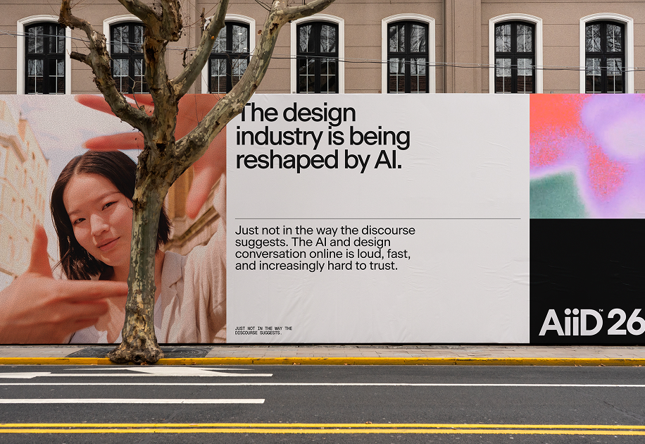
In large-scale applications, the identity becomes immediate, bold, and highly recognizable. Strong typographic compositions, high-contrast layouts, and expressive graphic elements are designed to capture attention quickly while maintaining clarity from a distance.

Whether displayed in public spaces, conferences, events, or environmental graphics, the system scales seamlessly, balancing impact and readability. The combination of editorial structure and expressive visuals allows AI in Design to remain distinctive across large-format environments.

Billboards large format example 1
Billboards large format example 2

Web

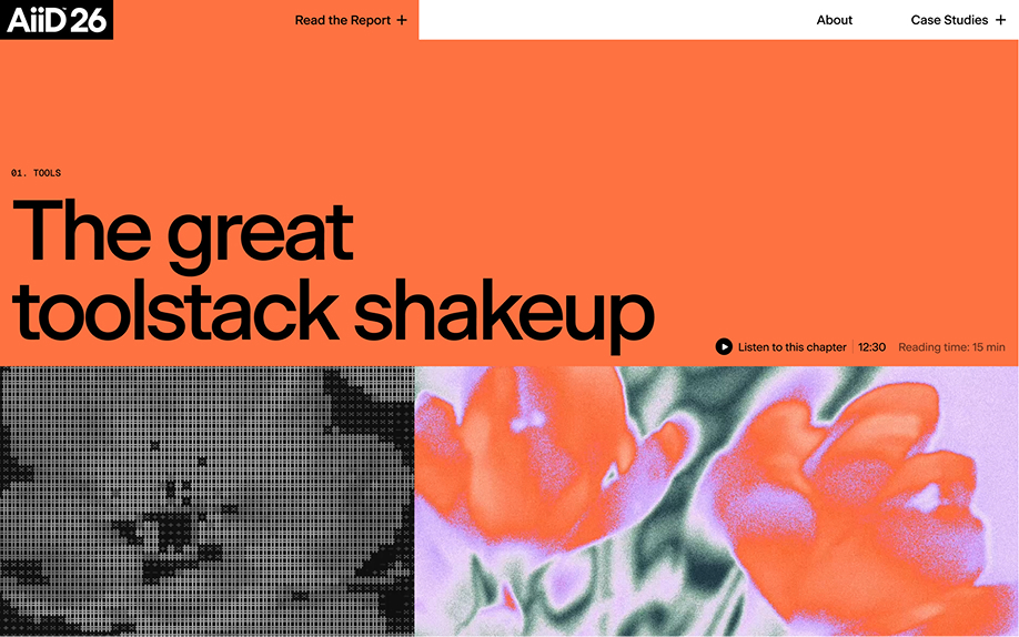
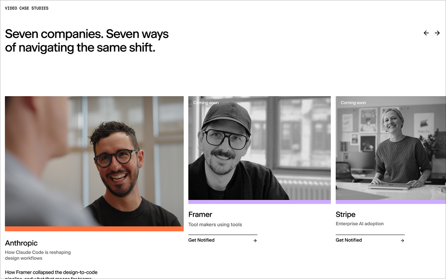
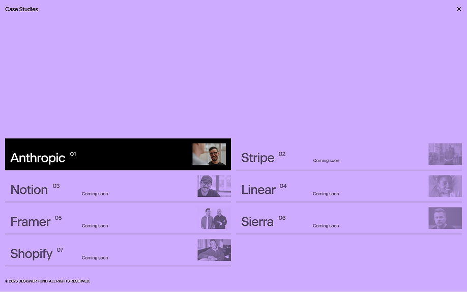
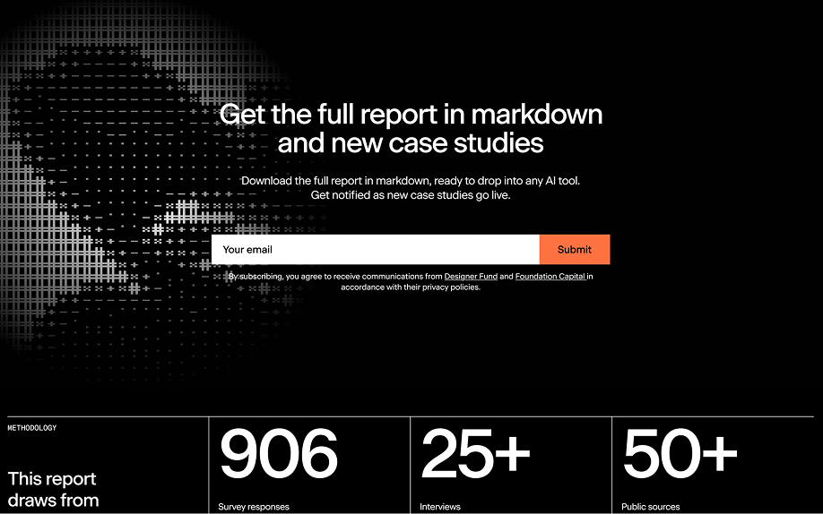
The website acts as the central hub of the AI in Design ecosystem, bringing together reports, interviews, research, company perspectives, and ongoing conversations around the relationship between design and artificial intelligence.

Designed as both an editorial platform and a living archive, the experience prioritizes readability, navigation, and discovery. The visual system adapts across chapters, articles, data, and media, creating a cohesive environment where content becomes the primary driver of the brand experience.

Web screen 1
Web screen 2
Web screen 3
Web screen 4

Social Media

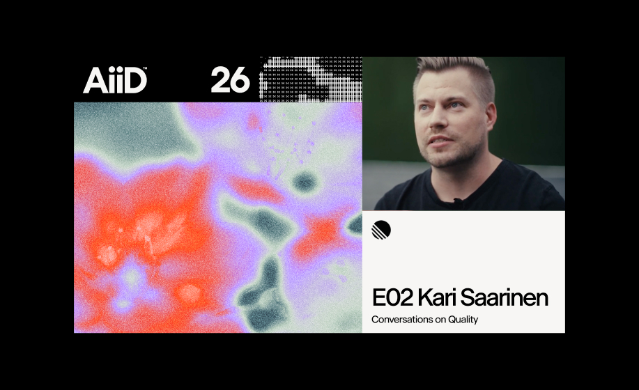
Social media extends the AI in Design identity into a more immediate and conversational space. Through expressive graphics, motion, key insights, quotes, and content highlights, the system transforms complex ideas into accessible and engaging formats.

The visual language is designed to capture attention quickly while maintaining consistency with the broader brand ecosystem. Each asset functions as both a communication tool and a recognizable brand expression, helping amplify conversations, share knowledge, and build ongoing engagement with the community.

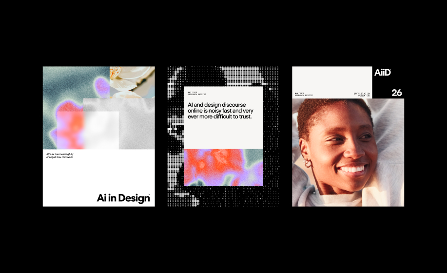
Social media brand applications